Saturday, September 29, 2012

It's a Beautiful Day for a Demo. . .

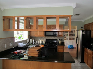
Today seemed like a great day to take down the upper cabinet over the peninsula. Piece of cake. It's just screwed into the soffit, right? Yes, well, that, and it weighs like 200 lbs. But after much coaxing we did it! And we didn't even have to take a sledgehammer to it!  Here's some before pics to jog your memory:


There was nothing wrong with them, per se, but they blocked a lot of light and conversation (us both being two tall people).

First thing I did was removed the doors on both sides. That was a pain, but it lowered the weight easily by 100 lbs, and therefore lessened my greatest fear during this endeavor - that the stupid thing would come crashing down and crack the largest slab of granite right down the middle - though that was still entirely possible at this point:


You can already get a sense of how more open it will feel when the thing comes down. (You can't? Well, you've got to use your imagination. . .)

I regret that there are no more photos until the finished product. Unlike some of the more popular blogs that have their own book deals, I did not set up a camera tripod to snap pictures every 5 seconds to document the action. But there probably would have been some interesting ones, ones that showed angry faces and cussing, a crying toddler, and finally good ol' hubby sitting on the counter having to support the entire cabinet on his shoulders as I ripped from the wall unscrewed the last screw. But we got it down, no one was hurt, and the countertop wasn't damaged, so I am amazed and relieved! 


Huge difference! The kitchen actually looks bigger, and the peninsula is more workable now without me worrying I am going to bash my head on the stupid cabinet.

So now the question is to remove the soffits or not to remove the soffits. We've already kind of decided against removing the ones over the cabinets, 1) because being right below the bathroom I bet there's something in them (although luck would have it there's nothing in them but there is in the ones we're considering removing - there was some old water damage on the ceiling of the soffit where the cabinet was removed. . .) and 2) it would be expensive to get new taller upper cabinets made, and 3) we picked out really cool pendant lights to go above the peninsula that we would really like to use - if we hung them from the soffit they would be too low and would burn our retinas.

So these are the current options:
1. Leave soffits as is. Put can lights over the peninsula (like the ones currently over sink)

2. Take down soffit over the peninsula only. Risk is that this may look weird with the soffit over the sink just kind of there

3. Take down soffit over peninsula and soffit over sink, but leave soffits over the cabinets.

Below is a crude representation of what the first option may look like if we took into account new shaker cabinet doors in white, added the can lighting, and ignored the backsplash and wall color. (Warning: Extreme amount of imagination and non-judgement of my Microsoft Paint skills needed to view the following pictures.)


Here would be option 2 removing only the soffit above the peninsula but leaving the one above the sink:


And here's still option 2 with maybe some open shelving added under that lone piece of soffit sticking out into space:


Or option 2 with a cabinet with a glass door under that lonely soffit:


And here's option 3 removing both soffits:


Can you picture it? Well at least if you can't, you hopefully got a good laugh.

So which option do you think will work the best? Does it look weird to keep the soffits above the cabinets?

Monday, September 24, 2012

Living Room Progress - Homemade Curtains DONE!!

So, we're finally getting close to having the living room done!!  All that's really left is to put some stuff up on the walls. I have my butterfly art project waiting in the "wings" - ha ha, I crack myself up. But anyways here's the BEFORE pics:


We took these pics shortly after we moved in and moved our old couch out to make space for the new ones being delivered.

And here is the room now in it's current state:


It's amazing what a bit of pattern and color does! I hated the wall color in this house but the patterns and colors make it work a lot better so I don't need to paint (at least not immediately!). Yea for saving money (that can maybe be put towards a new flatscreen tv??? ahem, David?? :) Because I totally want to have a Season 6 Mad Men Premier Party in here. Anyone in??

The curtains were super easy to make, but the fabric was a bit of a splurge, but we got it 60% off and with an additional 15% off teacher discount from Joann's, so it didn't hurt quite as much. I LOVE this fabric, so it was well worth it!! It is a bit of a crazy fabric, and I had the sample draped over the sofa for I think two weeks to make sure I REALLY liked it before I made the jump! In case you are interested, the fabric is called Robert Allen Khanjali Peacock - it is a very vibrantly colored turquoise ikat pattern. Here's a closeup:

I wanted to hang the curtains high and not block out too much of the light from the windows, so I bought new longer curtain rods from Target and hung them about 6 inches away from the crown molding. With the rods at that height, and taking into account hemming, I figured I would need each panel to be about 90 inches long. So 90 inches x 4 panels = 10 yards of fabric. The fabric itself is about 57" wide, so I decided to keep that width and not reduce it so that the panels were full and voluptuous :)

Once the fabric arrived, I laid it on the floor and cut the 10 yard bolt into 4 identical sized 2.5 yard pieces.

Since I was working on these at night after the baby child was asleep, I opted for a no-sew method using Stitch Witchery and my handy dandy ol' iron.


I hemmed each side (it took one evening to do each panel - probably would have been faster to sew it but oh well.). I decided to not go back over it with the sewing machine because I am lazy and impatient and it looked just fine the way it was.


I used ring clips to hang the curtains so that I would get a little more length out of them, hung them up, and voila!


So next on the list is to hang up some artwork on the walls and then that room will be at least temporarily finished (rooms are never finished for long, they kind of tend to evolve. . .) But for now, I am enjoying looking at my crazy curtains :)


Friday, September 14, 2012

Why is it so hard to pick a backsplash?

Maybe because I am trying to work with what we've got. Maybe if I was completely starting from scratch, I would do something like this:


But I will save that idea for our vacation house in Greece.

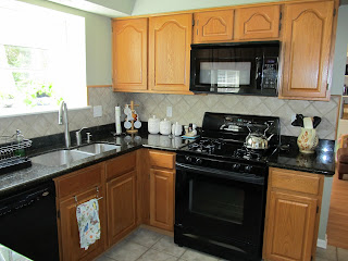
This is the actual kitchen (not in Greece) we are working with:


Pardon the mess - we were still moving in at this point! This picture is taken standing in the breakfast room looking towards the office/playroom. Below are some more pictures.


I included a closeup of the granite countertop because we are planning the kitchen redo around the stupid thing. Black granite would definitely not have been my first pick. And it furthermore irritates me when people think it's a good idea to slap new, expensive countertops on old and outdated laminate and oak cabinets to "update" the kitchen. You could get a cheaper countertop and paint the cabinets for better effect. But I digress. . .

Anyways, I feel bad ripping out nice granite. Especially since it is actually very beautiful and has grown on me. Hence the design around them.

Basically the plan is to replace the current cabinet doors with shaker style cabinet doors for a more updated, clean and modern look that would be a fraction of the cost of replacing all the cabinets. To save some money, we're going to have a local cabinetmaker make the doors for us unfinished, and we will paint the doors and the cabinet bases ourselves - white is seems will work best with the color scheme we have going on in the house so far. There are a few other things we plan on doing too, but I'll save that for another post :) This is kind-of an inspiration kitchen I have kept in mind:


So we're going to remove the current ugly backsplash (that is surrounded by a lovely brown oak quarter round that normally goes on the floor). But replace it with what??? It has to be something that does not compete with the granite. But plain old white subway tiles might make the room look too sterile. Which is why I liked the tiny mosaic in the above inspiration pictures - just the right amount of shimmer, but would totally go with the granite.

Problem.

I have no idea what backsplash that is. Why? Because just as I have copied pictures from someone's website without siting where I got them, so did the person I got them from, so, no source, and alas, no description of the tile. 

I have looked online for hours a bit and have come up empty-handed. Is it glass? Carrara marble? Mother of Pearl? Who knows. Probably is 3/8 or 5/8 in tile though. So that's all I've got. Oh and no stores in this area carry anything like it in person.

Sigh.

Another option that Home Depot actually carries is this:


That might actually be kind of cool - but would I grow weary of it's trendiness after a while?? Here's a couple of pics I found with a slightly bigger version so you can have an idea how it would look as a backsplash:


Kind of cool? Or not so much? What do you think?


Wednesday, September 5, 2012

Let's Start This Off With a Fun Project - Butterfly Art

I will start off by saying that no butterflies were harmed in the making of this art! These are paper ones, folks!


Did I mention I used to be a teacher? (Well, no, probably not since this is my second post and the first one was the self-deprecating intro.) Well I was.

And like all good teachers, I like to do arts and crafts, especially on the cheap. Why do we have to make things on the cheap, you ask? I am eyeing the soapbox but am walking away in 3...2...1...

I am in the process of trying to find an eclectic mix of pictures for a gallery display I want to put above the living room sofa. Something kind of like this:


Except not exactly like that, (that's what came up when I googled "eclectic picture gallery above sofa"), but hopefully you get the idea. (P.S. - strangely enough, I actually have a sofa almost exactly like that and a side lamp almost exactly like that, but I have a way different color scheme, as in not stripes with orange and green and brown) (P.P.S. - I am in no way attacking you if this happens to be your house. It's really not that bad. Really.)

Anywhoo, back to my art. So I thought I would incorporate some natural elements into my design scheme (fancy schmancy talk for I like butterflies. I think they will look good.)

I saw a cool butterfly thing at IKEA:


But it was a little more white than I wanted. Um, plus it was like 50 bucks. For paper cut outs of butterflies. Which got me thinking. . . maybe I could make my own version! So whilst at IKEA, I spotted an almost identical shadowbox frame (for $9.99 I might add - waaaay better than $49.99). It probably has a name like Rivkaslvkoout.

Oh, pardon me. It is actually called the RIBBA frame. (I was totally close.)  It comes with a mat but I chose not to use it.

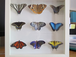
Next step was to find various pictures of butterflies I liked - I decided to go super colorful, but there are so many different species of butterflies out there you could pick all kinds of combinations. I printed these beauts off on photo paper. 


I then began the process of cutting these bad boys out. I will note that after cutting out a few with the antennas I began to develop arthritis in my hand, and decided they didn't look that good with antennae anyways. So my butterflies are antenna-less.


They look pretty realistic, right?! Kind of looks like a biology project from 9th grade. You know, the one your parents you did the night before (actually I did my own homework, FYI - but as a biology teacher I sadly saw that often). Speaking of parents, my mom actually came over at this stage, saw the butterflies on my desk from a distance and asked if they were real :) 

To make my paper creatures look a little less 2D, I decided to try folding them in half, so they would be more 3D like the $49.99 one from IKEA.


And here's a shameless kiddo picture of the "baby" working on her own art while mommy did hers:


For the background paper, I found some thick white scrapbook paper, traced the outside of the mat so it would be that same size and cut it.


I then laid out the butterflies in a way that looked good to me, ran a little super glue down the "spine" of the folded butterfly, and stuck them on. (I really didn't do any measuring - I'm sure you could to make it more precise, but I kind of just eyeballed it.) I decided to go with a more symmetrical layout than the IKEA one, but it would be super easy to lay them out in the upward swoop shape if you prefer that to the scientific type mount I strangely defaulted to:


So finally I slipped the art carefully in the frame, put the back on, and VOILA! Instant (well, not really instant, per se . . .) art.  But it was cheap. And I am really happy with how it turned out! I promise to take a picture once it gets hung up in my "eclectic gallery above the sofa".


Anyone else have any cool uses or ideas for a shadowbox frame?